07 Apr

UX copy is a relatively new term that was given birth alongside websites, apps, and software. And while people think it is synonymous with traditional and regular copywriting, UX copy has a distinct function. This post will enlighten you on what makes it different, why it is important to tech businesses, and how to write a compelling UX copy.
Imagine if you are using an app or a website without texts. Even with icons and images, it would still be challenging to navigate through it. That’s where UX copy comes in. It’s not just about filling your websites or apps with random texts or ”lorem ipsum.” But it enhances user experience by clarifying features, menus and even helping them decide what to do next.
UX Copywriting vs. Traditional Copywriting
Traditional copywriting is generally used to market products or services. More often than not, the writing approach targets the reader’s emotions, making them want to try out your offering. But the case is different with a UX copy. You need to be rational and understand how your text could smoothly transition your user from one page to another. Usually, these are shorter texts that help decrease user anxiety whenever they are within your platform.
Another main difference between these two is the writing process. When you work with a regular copywriter, you get them on board after creating all your marketing paraphernalia. But with a UX copywriter, you need to work with them at the early stages of designing a website, app, or software.
Is Writing UX Copy Easier?
The straight answer is NO. Writing shorter texts that are universally understood yet must resonate with your branding is never an easy job. It’s a different specialty that requires skills, experience, and vast industry know-how. Having said that, working with professional UX copywriters is a must to ensure a holistic UX design.
How Can Tech Companies Benefit from UX Copy?
While all industries could benefit from a well thought out UX copy, those in the tech niche should consider this a priority. As we all know, not everyone is well-versed when it comes to technology. But if you have a UX copy that can bridge the gap between your products and what your customers already know, then the likelihood of generating sales is much higher.
What Makes a Good UX Copy?
And now, let’s try to dive deeper. How can you say that a UX copy is effective? Here are some tips you can follow when writing one.
Simplify Technical Terms
Being in a tech industry means you have tons of technical terms and jargon. But you don’t need to use them, most especially if you are talking to end-users. It’s intimidating, and it leaves an impression that your brand could not relate to the market. The end results – high bounce rate and missed business opportunities.
Make it Short and Concise
When we say short, we don’t mean that you have to remove words carelessly. If you do this, your UX copy will sound robotic. Take note that you have to sound as human as possible, even if you are offering tech products.
The best approach is to make it concise. Rephrase a lengthy sentence where the message will remain clear and the same.
Start With the Intended Action
Again, UX copy helps your users take the next action. So when you write one, begin your sentence with what needs to be done. Look at the difference between the samples below:
Sample A: If you want to see the full product description, click here.
Sample B: Click here for the full product description.
Stay Away From Double Negatives
A good UX design, in general, will make use of the least cognitive load. Sentences or statements using double negatives can be quite confusing. You don’t need that in your UX copy. Here’s an example:
I don’t want to unfollow.
This made you pause for a bit, right? Don’t let that happen to your visitors or customers.
Use Number Format Instead of Words
This is pretty straightforward. Instead of writing five, just use ‘5’ in your UX copy. This saves you space, and it’s faster to discern.
Be Consistent
If there are similar functions of features across your platform, make sure to use the same words. This avoids confusion, and it also forms part of your branding. So, for instance, you used ”Book Your Appointment Now”. You should never change it to ”Schedule Your Appointment Now” on the next pages.
Maximize Progressive Disclosure
At times, we are tempted to give the full information to our users in one go. But that could be overwhelming. When writing a UX copy, reveal information only as necessary. You can add a ”Read More” button if in case users want to probe further.
What to Consider When Writing UX Copy?
Similar to when you are writing a traditional copy, you must always consider your market. What language are they using? What tone is best for them? What are their online habits? Which device is your market likely to use? Get as much information about your audience and base your texts or UX copy from there.
Also, we recommend that you take a look at other similar platforms and find commonalities. What words are the same? Take note of these and see if it fits your platform as well. Remember, they use similar terms for a reason. Perhaps, they have already found out that these are the terms that work for their audience.
Samples of UX Copy for Tech Products
Here are a few samples where you can get ideas for your own UX copy.
Viber

There are many instant messaging apps today. And so what Viber did was to highlight that their platform is free and secure. In just one sentence, they were able to tell their market what makes them stand out from the rest.
Apple

Apple did a great job promoting Arcade. It’s straight to the point, no-frills, and you can either Learn More or Try it for Free. Either way, you are trapped to hit one of the CTA buttons.
Slack

Whoever writes for Slack must have an award. Every time that we visit their official website, we see a new UX copy that is both creative and effective.
Docusign

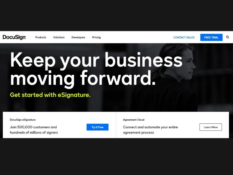
Take a look at the social proof used by DocuSign. Instead of directing you to a page filled with testimonials, they encourage you to join the 500,000 customers they currently service.
Huawei

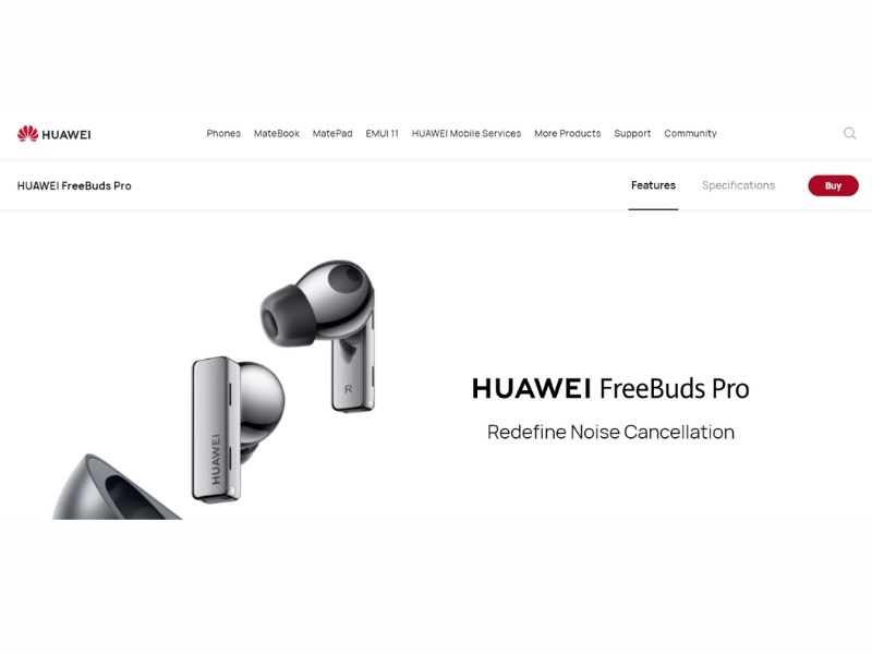
The last sample we have is from Huawei that used only three words for their UX copy. Come to think of it, there’s nothing more you can say about wireless buds. And so just redefining it makes sense. That alone will push you to check out the product and learn more.
Conclusion
UX copywriters are a different species of writers. Are you required to win a Pulitzer prize to be one? Not necessarily. But you need to have skills different from traditional copywriters. It’s about downsizing texts yet being able to persuade them to take the next action.
Sounds complicated? It surely is. And that’s why you need professionals to do it for you.


