07 May

Not all ads are compelling, interesting, or impressive. After all, we view thousands of ads in a day. Some we’ll ignore, while some others we’ll take time to view or pore over. That’s the case for print ads. Some print ads may not be impactful. In some cases, no matter how controversial or brilliant, it will leave a bad impression or be forgetful. To avoid that, here are 30 ineffective print ads to learn from for your next ad campaign.
All images are from Ads of The World unless otherwise indicated.
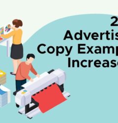
1. Electrolux
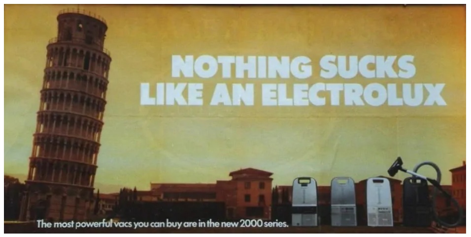
Image credit to My Customer
Sometimes interpretation can cause an ad to become ineffective. It’s evident in this example from Electrolux. You would think it’s a clever ad, but the word “suck” has a different connotation when marketed to other countries. According to My Customer, the ad was a hit in the UK, but it was a different story when it came to the US.
2. Coca-Cola
This one by Coca-Cola doesn’t seem to get anywhere. There are too many things happening in the ad, and it doesn’t look clear. Many would agree that while the concept appears unique, it’s one of the most ineffective print ads out there.
3. Wet Ones

Sometimes, ad imagery works, but the messaging gets lost. This one by Wet Ones seems like a good, solid concept, design-wise. But the messaging could have been improved, as some would say. The tagline, in particular, “What a Beautiful Mess,” may not seem appropriate either, and it may confuse the reader.
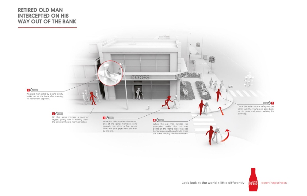
4. FirstBank
Here’s an example where the headline compels you to read the ad, but the copy doesn’t make sense. FirstBank tried to differentiate itself from the competition by writing how to play dominoes instead of focusing on a mortgage. It will make readers question how dominoes and mortgages connect. That’s why, unfortunately, this ad makes it in our list of ineffective print ads.
5. Saucony
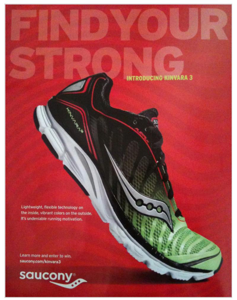
Image credit to Bad Ad Weekly
What makes this ad questionable is its tagline: “Find Your Strong.” Grammar sticklers may ask, “find your strong, what?” While it may seem inspirational, the tagline may drive away consumers on how to find their version of strong.
6. Reebok
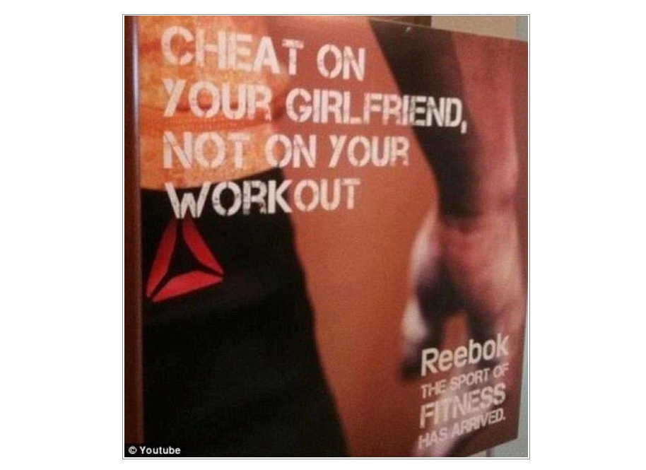
Image credit to Business Insider
This ad by Reebok tries to position the brand by promoting an active lifestyle. However, the messaging itself is convoluted as it implies that men should cheat on their girlfriends, but not their workouts. That makes it one of the most controversial and ineffective print ads.
7. China Times

Ads like this one from China Times are questionable. The imagery in itself is already a cause for controversy. With the ad copy, it will make you wonder why this ad was approved in the first place.
8. Bawabat Al Sharq Mall

The print ad looks inspiring and uplifting. But the messaging needs more improvement, especially on the delivery. The copy seems confusing as you read it, but it does have a good intention in celebrating mothers.
9. Toyota

The ad does seem clever, but the overall theme is where you might doubt the ad’s theme. It makes you wonder why the person used a Prius in the first place. That’s why it makes you question the ad’s effectiveness in delivering a coherent message.
10. Wells Fargo

Image credit to Wall Street Journal
Wells Fargo wanted to emphasize the idea that parents could plan their children’s financial future. However, the overall ad messaging doesn’t translate well because of how it may belittle the concept of a child pursuing a creative life. The Wall Street Journal even reported that the ad sparked backlash, and eventually, Wells Fargo had to pull it.
11. McDonald’s

Image credit to USA Today
When it comes to McDonald’s, you’d think of food. But in the rare time, McDonald’s didn’t have any imagery of food in the ad, they received outrage. Their print ad seemed to copy mental health PSAs, but their ad wasn’t effective enough to get the message out.
12. Fairlife
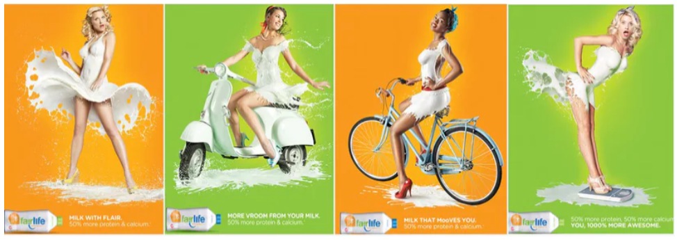
Image credit to Bustle
The Fairlife ad doesn’t seem to get its message across, as it tries to promote better milk-drinking habits. The messaging is off as it implies a suggestive sexual nature, and some have sounded off on it. That’s why many would consider it as one of the most ineffective print ads. It tries to advertise that consumers should drink their product, but it’s the portrayal of women that contributes to its ineffectiveness.
13. Burger King
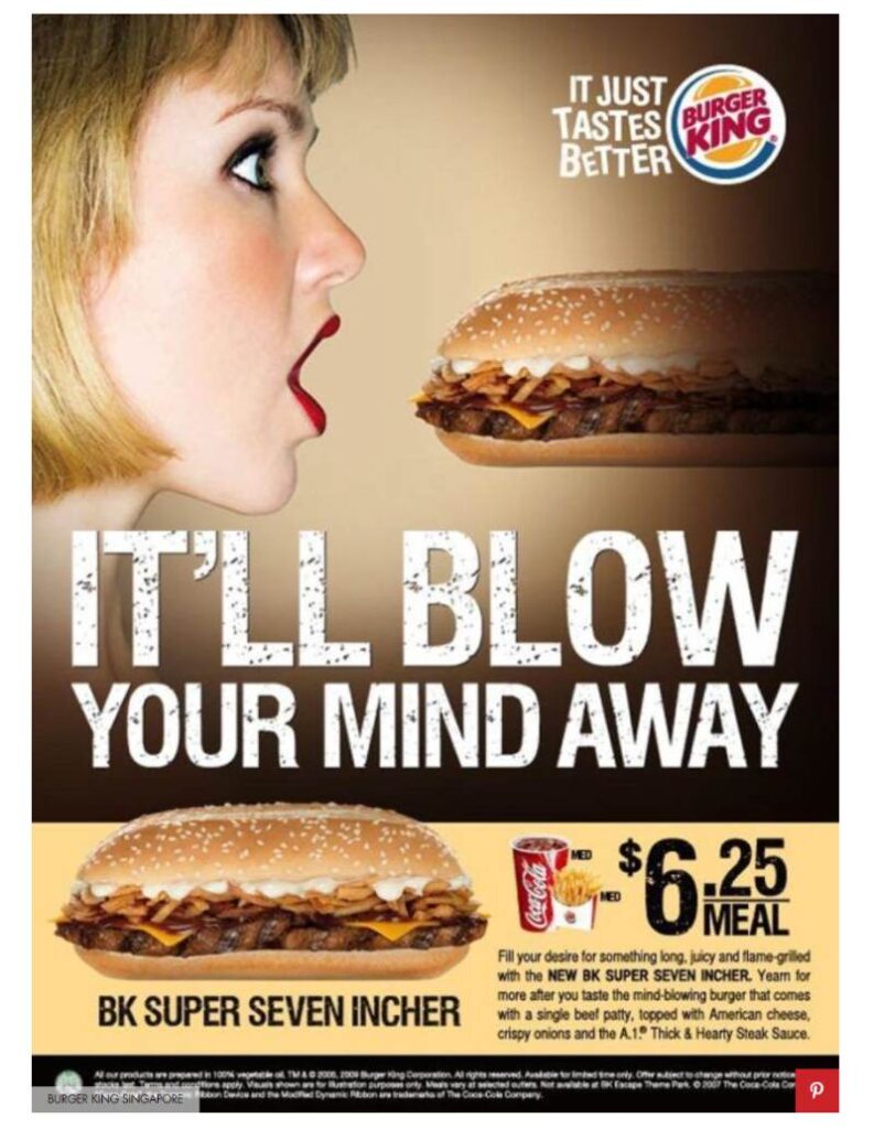
Image credit to Cosmopolitan
Burger King has had its share of hilarious ads, mainly focusing on their competitor, causing people to laugh. But, one ad, in particular, wasn’t fond of the messaging and imagery of the ad. This one isn’t an effective ad, considering that it focuses more on a sexual nature than promoting their new sandwich.
14. Fiat
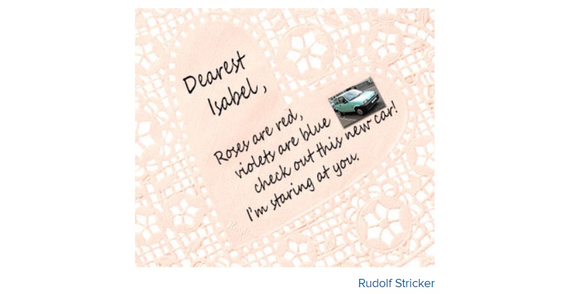
Image credit to Cracked
Even if the direct mail marketing campaign was in 1994, many experts still talk about this infamous case. Fiat sent female customers on what seemed like love letters, but it was borderline creepy and stalker-ish. The messaging was different from their intentions, making it an ineffective print ad.
15. Match.com
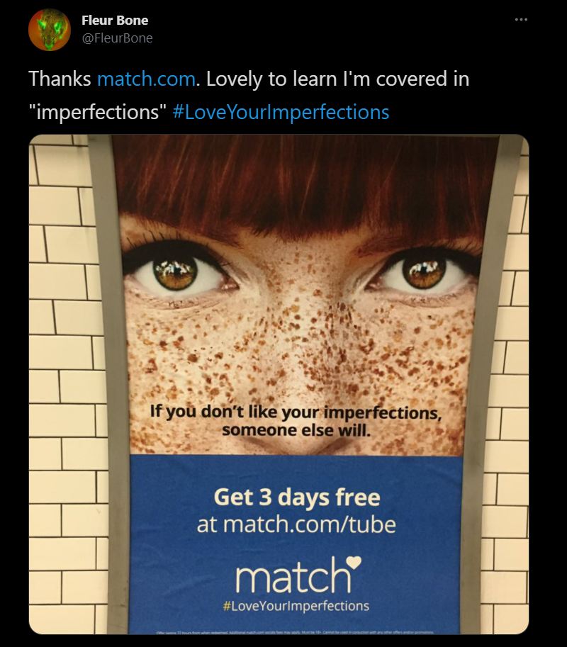
Image credit to FleurBone from Twitter
Match.com missed the mark when they published this ad. While they may mean well, in terms of accepting imperfections, it’s offensive because they imply freckles are imperfections. It’s also ineffective because they could have used a better term or way to frame imperfections without resorting to physical features.
16. Founders Brewing
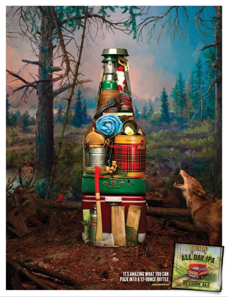
This ad by Founders Brewing may not get its target audience. They position beer drinking as a must-do whenever the family goes camping or going to the lake or beach. For this reason, many consider this as one of the most ineffective print ads.
17. Panasonic
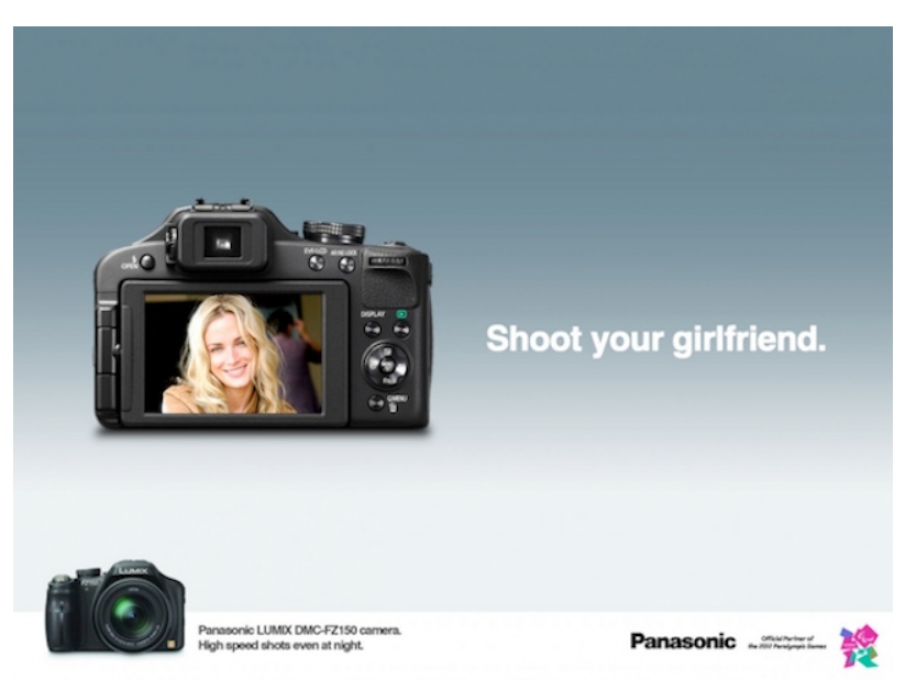
Some print ads don’t make it to circulation, and it’s better left unpublished. But Chip Shop manages to give advertisers a platform to publish their ads, despite potential backlash. Here’s what Panasonic may have posted on print, and luckily it wasn’t printed. The tagline and copy seemed to indicate violence rather than casual photography.
18. 140 Characters Film Festival

Here’s an example of a campaign where not all ads were consistent. The Bieber design for their campaign looks great, but the ad copy is not clear, even as you zoom in on the message. It didn’t seem to make sense, unlike the other ads in this campaign. When you read the message as a whole, you’ll get the gist, but when you read it little by little, you might have to fill in some missing words to make the copy clearer.
19. Axe
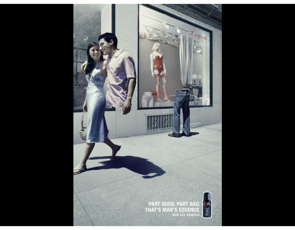
Image credit to Ad Forum
Sometimes, ads don’t work. The messaging is there, the imagery is there, but it’s not enough to become compelling or impressive. It states the obvious and may not convince the target audience to try the new product.
20. Standard Chartered
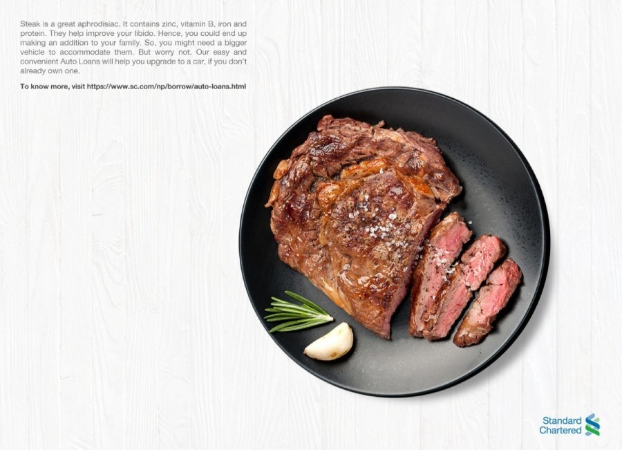
Image credit to Ad Forum
Ads without headlines or taglines might become an ineffective print ad. This one by Standard Chartered is a good example. The way they write the ad copy seems convoluting since it jumps from one point and to another. Even Mark Duffy from Copyranter isn’t pleased with how Standard Chartered published this ad.
21. Dettol
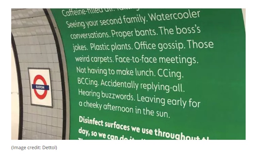
Image credit to Creative Bloq
Here’s an example of an ad that tries to connect with its target audience but fails. Many consider this as one of the ineffective print ads because it’s cringeworthy. Creative Bloq reported on this and included responses by those who saw the ads. Many say they would prefer working from home than reading the ad or consider the messaging on the ad as an enjoyable collective experience.
22. Durex
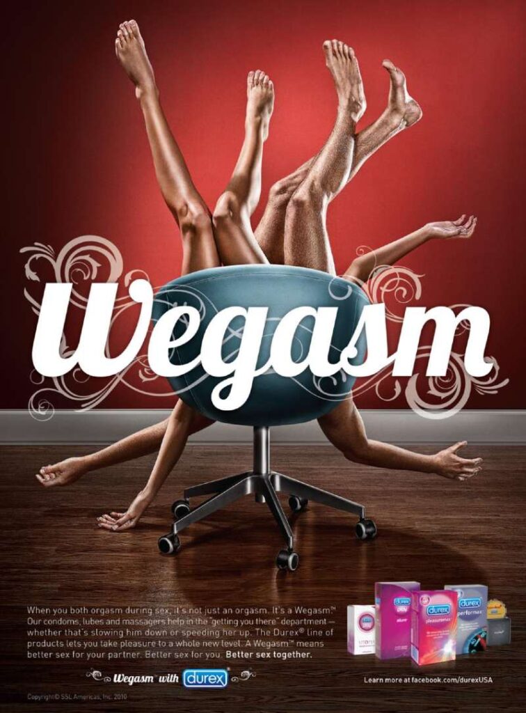
Even if Durex posts funny print ads, sometimes their ads don’t click instantly. Or, in this case, they tried something, and it didn’t work. Their intentions may lean towards a better intimate experience, but the headline tries to make something happen, but no one may catch on.
23. Co-Op
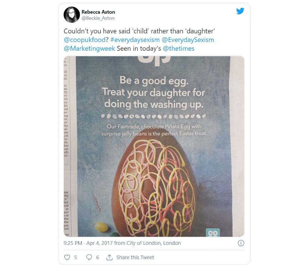
Image credit to Rebecca Aston on Twitter
This print ad by Co-Op has received backlash for its sexist messaging. It’s an ineffective print ad because it still implies that only women should do household chores. According to the BBC, that Co-Op apologized and explained the meaning behind the ad. Plus, they also took it down.
24. RCDA

Here’s an example of an ad where the copy is short and lets the imagery serve as the explanation or the other way around. It seems like an ineffective print ad because it suggests that if a boy wants to adhere to standards of masculinity, they should take karate lessons. Another way to interpret it is, if they stick to what their perceived gender is, they can take karate lessons to defend themselves. Either way, it’s a confusing print ad.
25. Oral-B
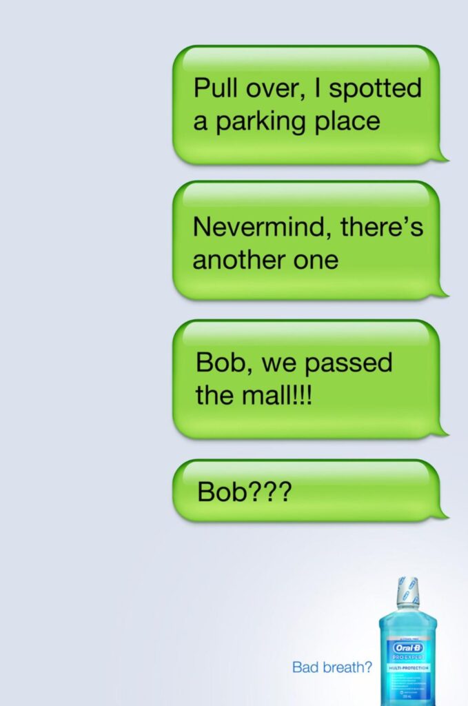
When you first read this print ad, you’ll think why Oral-B made this in the first place. What’s the connection of text messages to a dental product? It’s one of the reasons why many consider this as one of the most ineffective print ads. You want to make sure that your ad copy clicks right away.
26. Hyundai
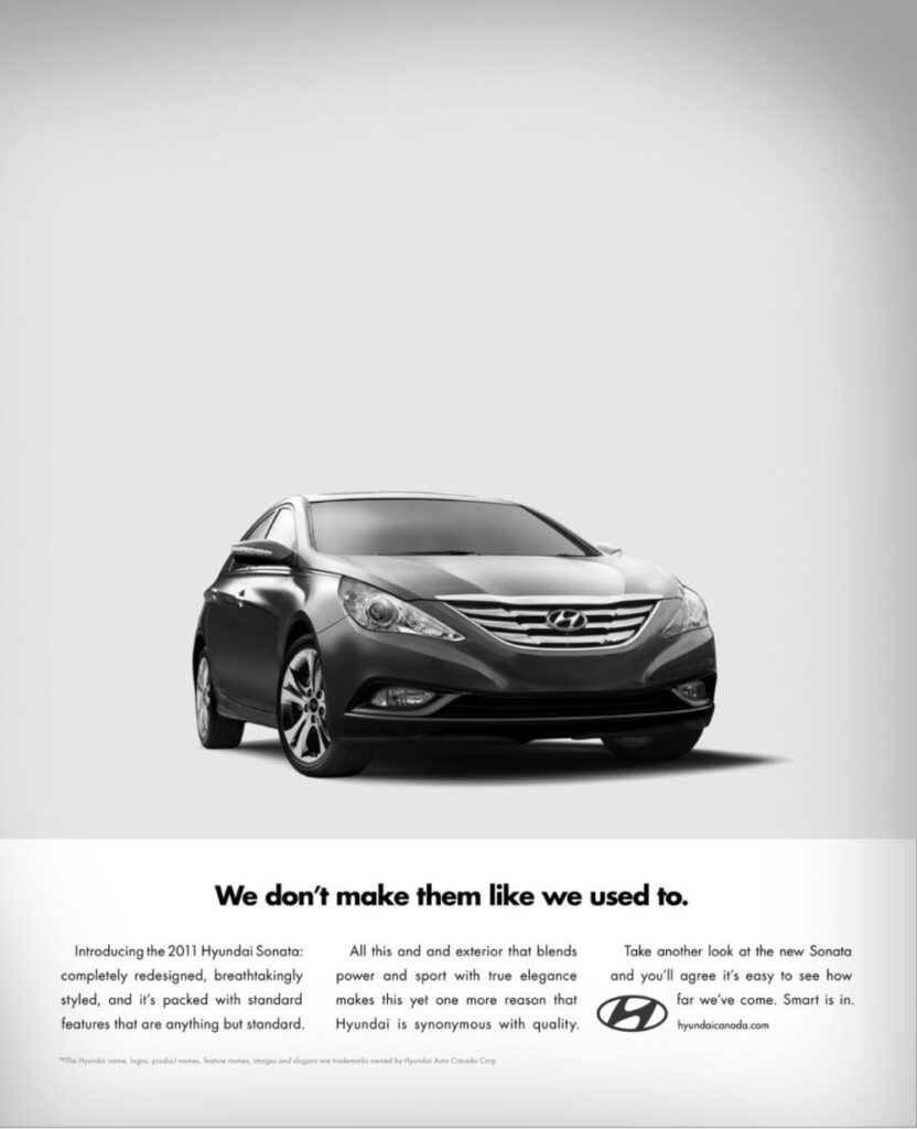
It may seem like a good idea to pay homage to a competitor’s famous print ad. But when it’s a signature design and messaging style, people would still go for the original. Hyundai did try its best to honor Volkswagen’s style, but not many are convinced over the execution of the ad. Many believe that Hyundai may have benefitted from doing an original idea than using an iconic ad style that might hurt car sales. Plus, there’s also a typographical error, which could further contribute to the ineffectiveness of this print ad.
27. Dove
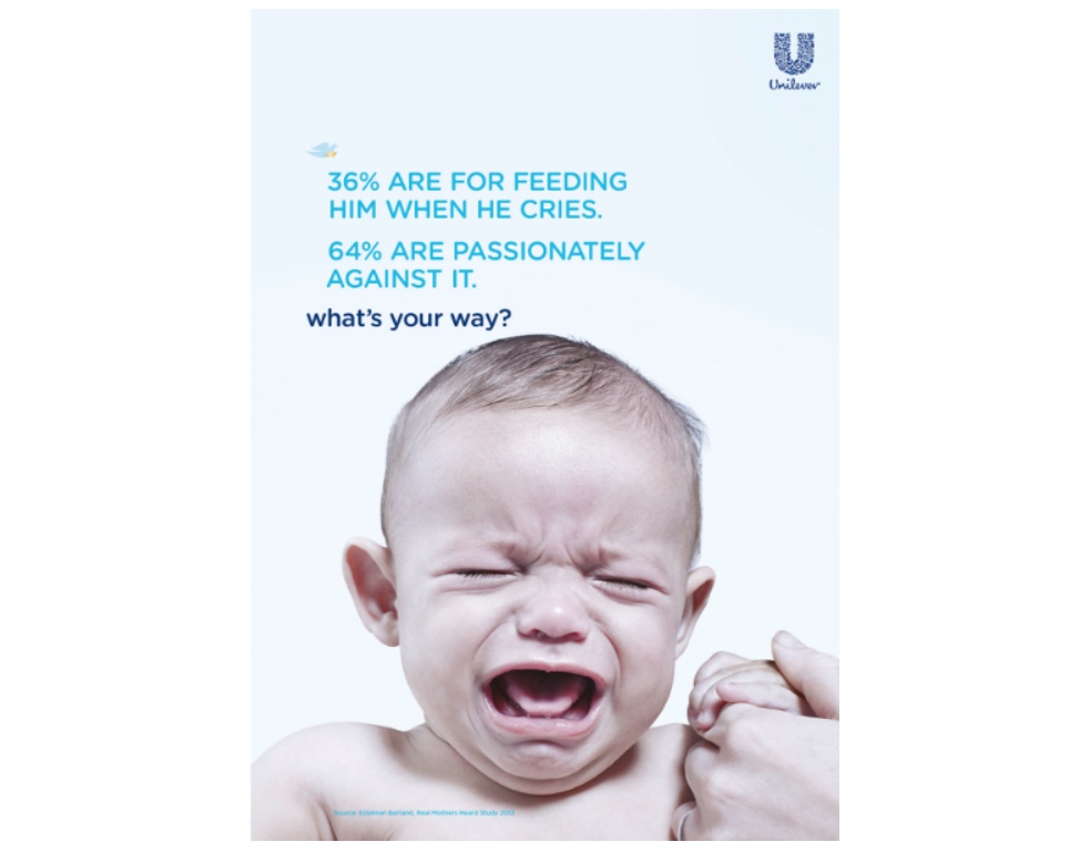
Image credit to the Advertising Standards Authority
Dove’s breastfeeding campaign received backlash and complaints from those who saw the ad. It uses data, which is a plus in most print ads, but the messaging may seem to discourage the idea of breastfeeding in public. The image doesn’t help either since the child is crying. As the Advertising Standards Authority reported, Dove apologized and took down the ad.
28. Benchmark
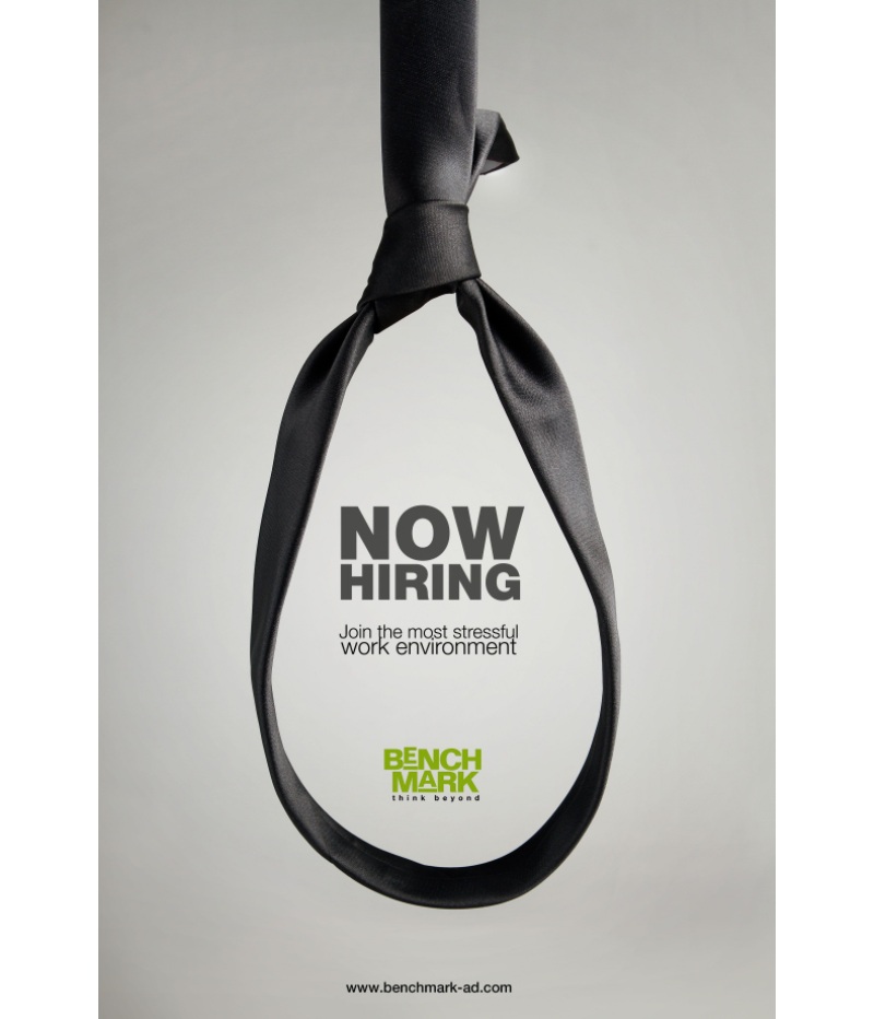
Image credit to Pinterest
If you want to hire people, you want to make sure it’s enticing. Benchmark does want to set itself apart by creating a funny print ad. It may even entice employees that want to take on the challenge. But it’s equally discouraging, too, considering that people may not opt to work in a demanding environment.
29. Incredible India

Here’s an example of a print ad with a puzzling headline. Incredible India makes it clear that you can have a slice of Scotland in India. But for those who read the ad would be confused by the message. It makes you question what they are promoting, and it can leave readers or viewers baffled instead of intrigued.
30. CDW
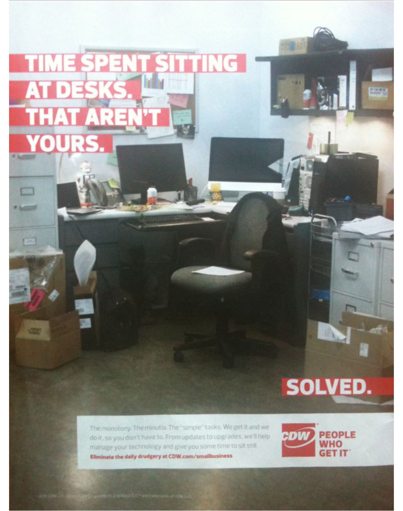
Image credit to Bad Ad Weekly
Ads like this one from CDW will make readers scratch their heads. The headline isn’t clear, but you get a sense of what they’re saying when you read the ad copy. It’s a print ad example that doesn’t have a consistent clear messaging.