27 Aug

Facebook reported that they see a rise in daily active users. That means, it’s the perfect opportunity for companies to advertise because they can reach hundreds and thousands of users. That’s the thing since companies know people can view and click on their ads, you might have the challenge of standing out from your competitors. Even if that’s the situation, you can still connect with your audience with compelling ad copy and design. Get your audience to stop scrolling on their feed. Increase page views with beautiful design and well-written copy. In this article, I list 15 Facebook ad copy examples. Plus, know what makes them eye-catching and how to apply it to your Facebook ads.
1. Google
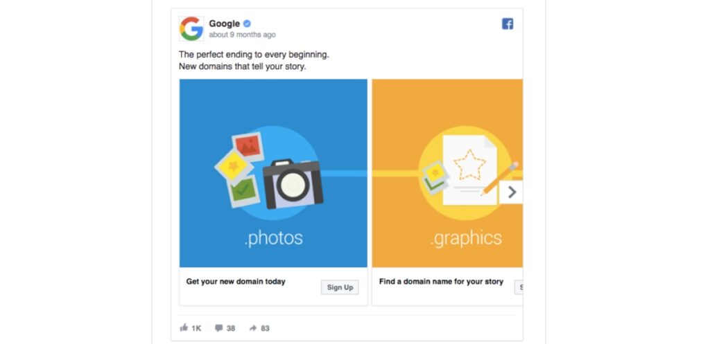
One of the best practices in writing an ad copy is to focus on the audience. Always address them by saying, “you.” Since you want your ads to appeal to your users or customers, make them feel important.
Google does that well by incorporating “you” on the headline and the other copies.
Plus, the use of “the perfect ending to every beginning” will make the user stop and look at the ad to think about the statement. Sometimes, it’s also good to make things rhyme. It makes it much more catchy.
2. Unbounce
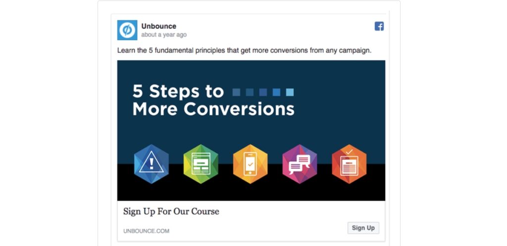
You want to make your user’s life much easier. For you to illustrate this, you can show it in steps.
Unbounce details the process of getting more conversions in five easy steps. After all, in an ad, you won’t have much space or characters to tell everything. Unbounce does an excellent job of making the process simpler.
Plus, on the ad design, it helps to visualize the process. It will make people curious about it. This will make them click on the Call-to-Action (CTA) button and sign up for it.
3. Soylent
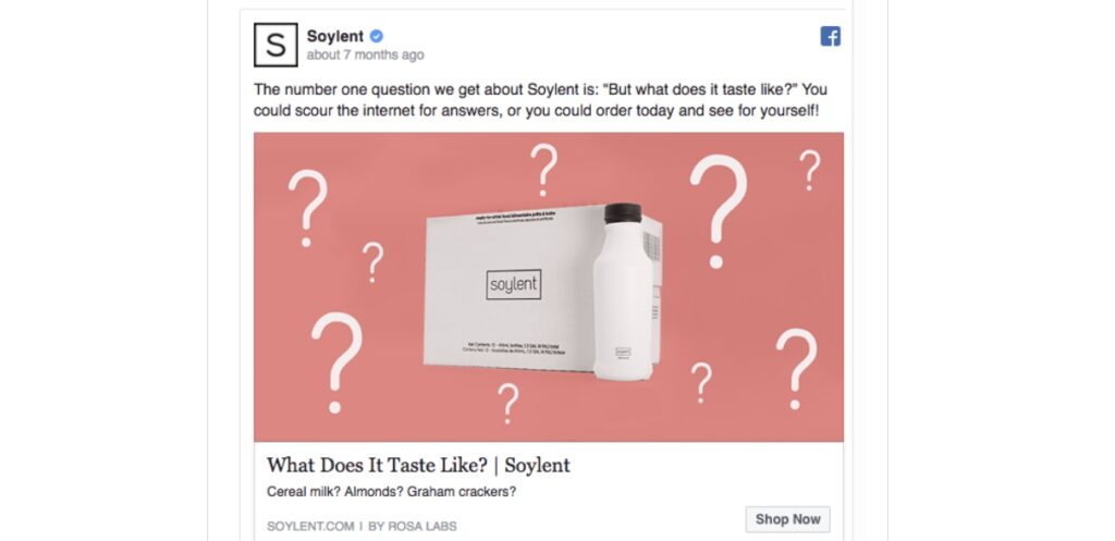
Spark people’s curiosity by asking questions on your ad copy.
Soylent does a great job of doing so by asking the questions customers might ask about their product. This will enable their potential customers to click on the CTA button. It might get them to read more about its taste and ingredients. This will prompt them to click Add to Cart and get their first taste of Soylent.
4. SumoMe
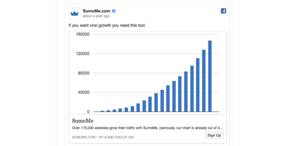
Sometimes, it’s better to keep your ad copy short. But you need to make it more compelling that it’ll make your potential customer stop scrolling on their feed.
In just nine words, SumoMe can entice potential users to view the ad. On the ad, they also put a power word: viral. Many companies or individuals want to attain that goal. Let your service or company help them achieve it.
Plus, they made great use of a graph too. You want to make sure that you can captivate your audience through data.
5. The Citizenry
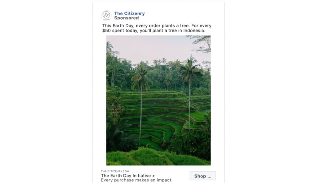
On major events or holidays, companies would advertise and promote their products or services. Some would take it up a notch by offering something free or making a pledge.
The Citizenry published an advertisement on Facebook to celebrate Earth Day. As most companies would focus on making a sale, The Citizenry promised to plant trees for every $50 spent during the holiday. It’s an admirable initiative that would prompt people to purchase a product and make a difference.
6. Purple Carrot
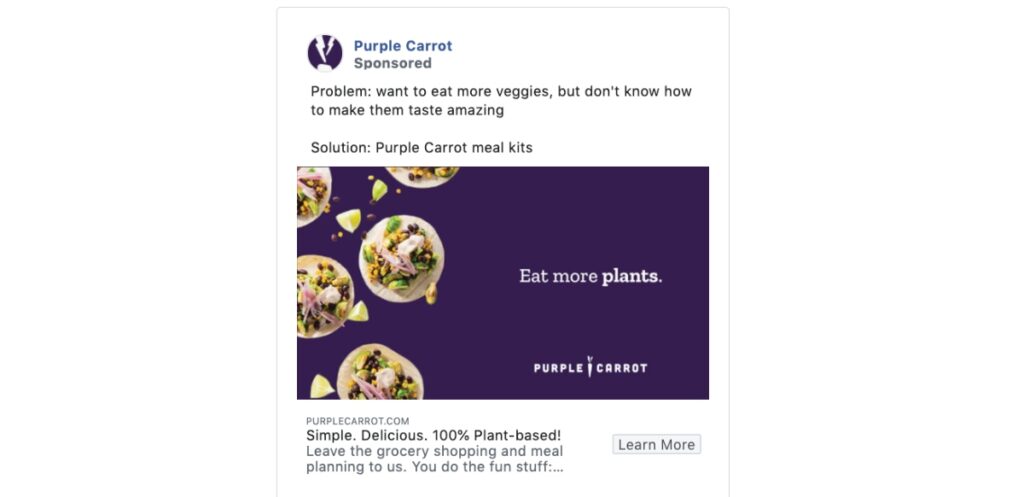
You always have to keep in mind what issues your customers are facing. This way, you can solve it and learn how you can put your spin on it.
Purple Carrot offered a four-word solution to address their potential customers’ concerns. On top of that, they do the hard work by shopping and cooking. All the customer has to do is wait for their food to arrive.
7. Joybird
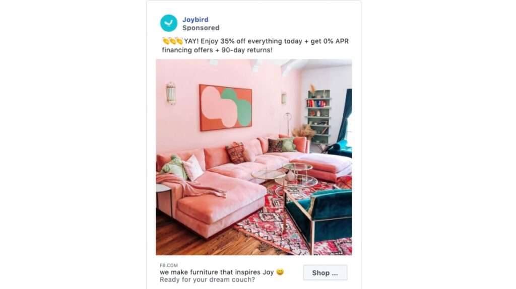
Write an effective copy by adding numbers, percentages, or statistics. It’s always a good idea to add data or numbers because people trust data or numbers.
People love to see discounts, zero interests, and return guarantees. Joybird incorporates all three in their ad. They offered a 35% discount, 0% APR (on some financing options), and a 90-day return guarantee.
Plus, they take it up a notch by adding urgency. They used the word today. It also signals the fear of missing out (FOMO), which might enable people to click on their CTA.
8. Herbivore Botanicals
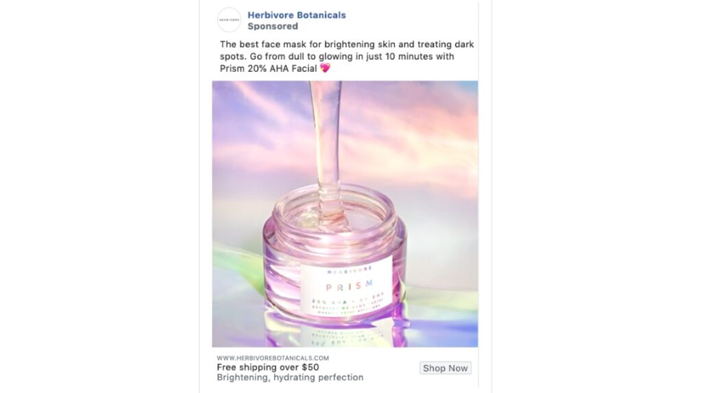
Make someone feel good when they’re using your product.
The best thing about the Herbivore Botanicals ad copy is the 10-minute guarantee. They indicated common skincare problems. By using their product, a customer can look AND feel much better in under 10 minutes. People want an instant solution to their problems. Indicate that on your ad.
Plus, the CTA below will get them to click because of free shipping. Everyone loves to read those words on an ad.
9. Allbirds
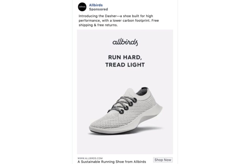
Are you shifting towards greener initiatives? Perhaps you already have them in place, but want people to know it.
Allbirds targets their environmentally-conscious customers to give their footwear a chance. In doing this, they write “lower carbon footprint” on the ad copy. This could compel potential buyers to check out their selections and purchase a product.
Plus, they indicate “free” twice on shipping and returns. It’s always nice to see the word free.
10. Pipette Baby
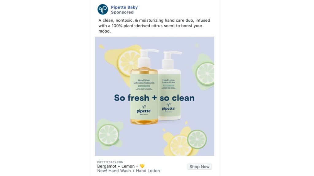
Heighten your audience’s senses. Apply the show and tell technique used by ad copywriters.
In the case of Pipette Baby, they wrote the scent on the ad copy. Most might be familiar with a citrus scent, and some would consider it pleasant. It helps when companies put sense-related descriptors, so it’s easier to imagine how it might smell or taste. They also added, “boost your mood” because that would be an expected feeling when smelling the product.
11. Billie
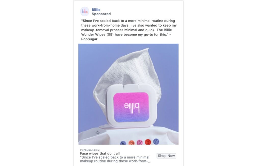
Social proof is a great example to add to any ad copy. It’s one way for you to establish trust with your potential customers. Plus, it might persuade them to buy your product, knowing others have done so.
Billie used a snippet of a review from Popsugar and used that as the ad copy. Sometimes, it’s best to let others do the talking for you. If you already have a compelling copy for your ad, you could use social proof as supporting evidence.
12. Glossier
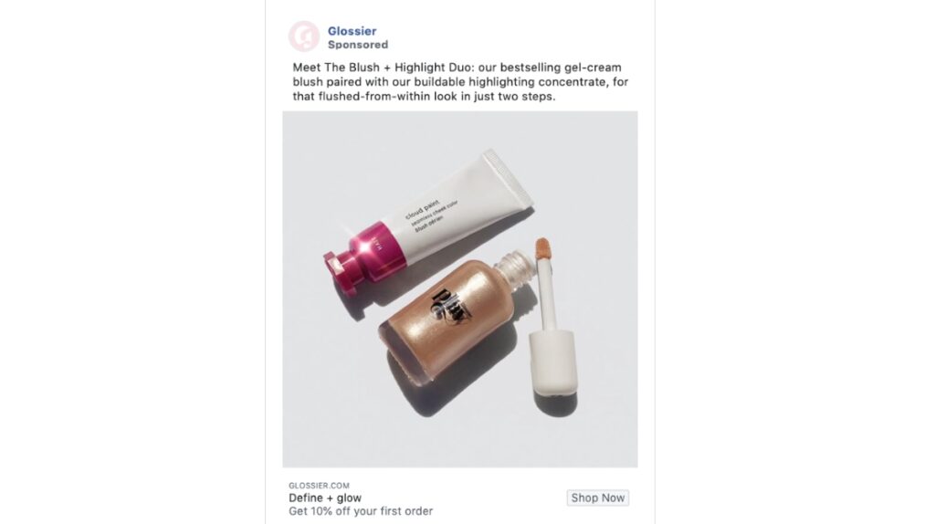
Many customers want a quick and easy solution to anything. For example, make them feel they could do an hour’s worth of routine into twenty minutes. That’s what Glossier wrote in one of their ads.
For many people, make-up takes a lot of time. A make-up or beauty guru would take ages to create the perfect look. Glossier promises to simplify the process of applying make-up easier and faster through its products in two steps. They don’t have to use bronzers or powder or whatnot. Plus, they also added a discount on the bottom part of the copy for those who have yet to buy their products.
13. Dollar Shave Club
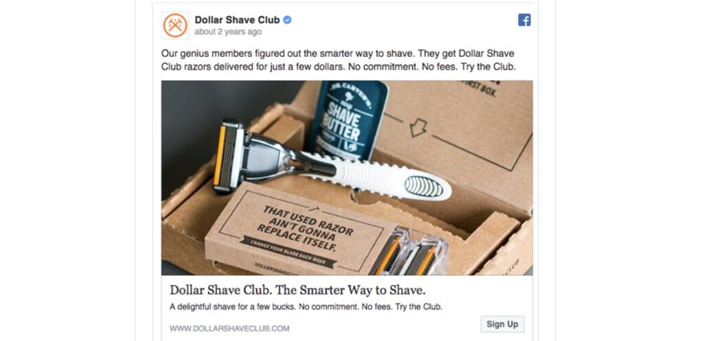
Make people feel like they’re in good company when they use your service or product.
That’s what the Dollar Shave Club did on their Facebook ad. They created an air of exclusivity where their members get a better shave by using their products. Get them to feel like they’re missing out if they don’t use your products. For those who do use them, make them feel valued and part of the club.
They also add the “no commitment and no fees” copy too. Subscribers can cancel anytime without worrying about hidden fees. It’s also great they included a CTA, “Try the Club” for those who just want to give them a shot.
14. Buffy
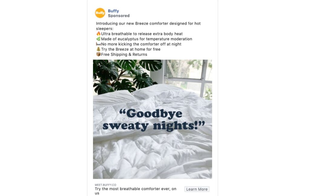
Showcase both features and benefits. On any ad copy, it’s a must you include benefits. It’s the reason why you’re different from a competitor and they should buy from you only. This is a practice done in writing product descriptions.
Buffy makes that work on their ad. Read their copy and imagine if they only said Ultra-Breathable and Made of Eucalyptus. That will prompt you to ask, “so what?” You’ll scroll down your feed and forget the ad, right?
They indicated how the features would benefit the user. That’s what made their ad effective. So you know how different their blankets are from their competitors. Plus, it’s how they solve the issues of hot sleepers.
15. Feather
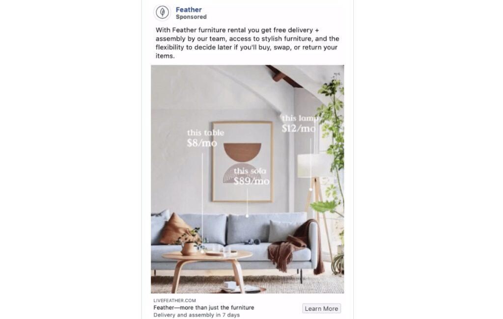
Give your customers options. Let them know what you offer and how they can avail of your products or services. Make your customers feel like they have control over their purchases.
Feather allows for flexibility on how people can rent their furniture. They indicate that in the latter part of their copy. It’s strategic because the audience would like to read “free” first. Then know what the company can provide for them.
Final Thoughts
Don’t let your efforts in advertising on Facebook go to waste. Even if design may captivate your audience to view your ad, persuade them with a well-written copy. Take notes from the companies above and how they nailed it! Who knows, your ad copy might turn up in a list someday and have companies follow your style.
If you don’t have time to craft compelling copy or content, hire a writing service like Content Fuel. Delegate your writing tasks such as blog posts, articles, and newsletters. Focus on what matters in your business. Level up by using Content Fuel and receive SEO-friendly content and copy for your business. Plans start at $389/mo. Get started on a Content Fuel plan today.
