21 Apr

Clarico finds that people see around 5,000 ads daily. Not everyone will remember the ads because they might ignore them. Despite your best efforts, sometimes a good ad can be overlooked, while others take the spotlight. To avoid that, you might have to resort to producing a funny ad that people would get a kick out of. And if you want to see the best funny print ads of all time, read more about it below.
All images are from Ads of the World unless stated otherwise.
1. Utopolis Cinemas

Let movies come to life with realistic effects. The print ads from Utopolis Cinemas are a hilarious take on movies like Titanic and Free Willy. As the ad copy reads, “Reality Sucks,” it’s a statement all of us can relate to. Plus, it may suggest that it’s best to leave unrealistic experiences to the movies and watch them directly.
2. Kiss FM 97.7
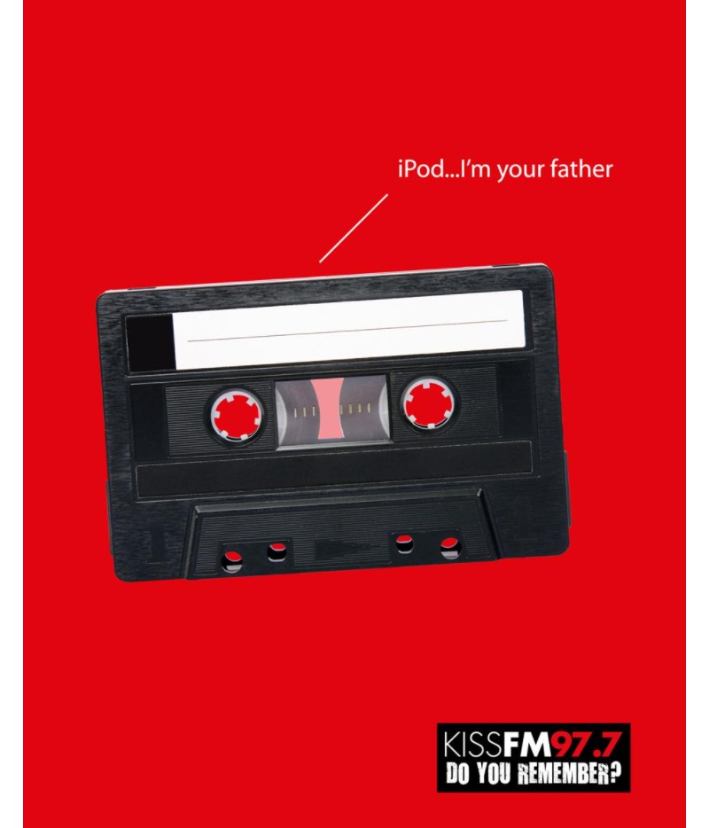
Here’s a funny print ad paying homage to pop culture. The Kiss FM 97.7 ad copy reads, “iPod… I’m your father,” with a black cassette tape saying that. It’s a funny reminder that we used to listen to cassette tapes before technology took over.
3. McDonald’s
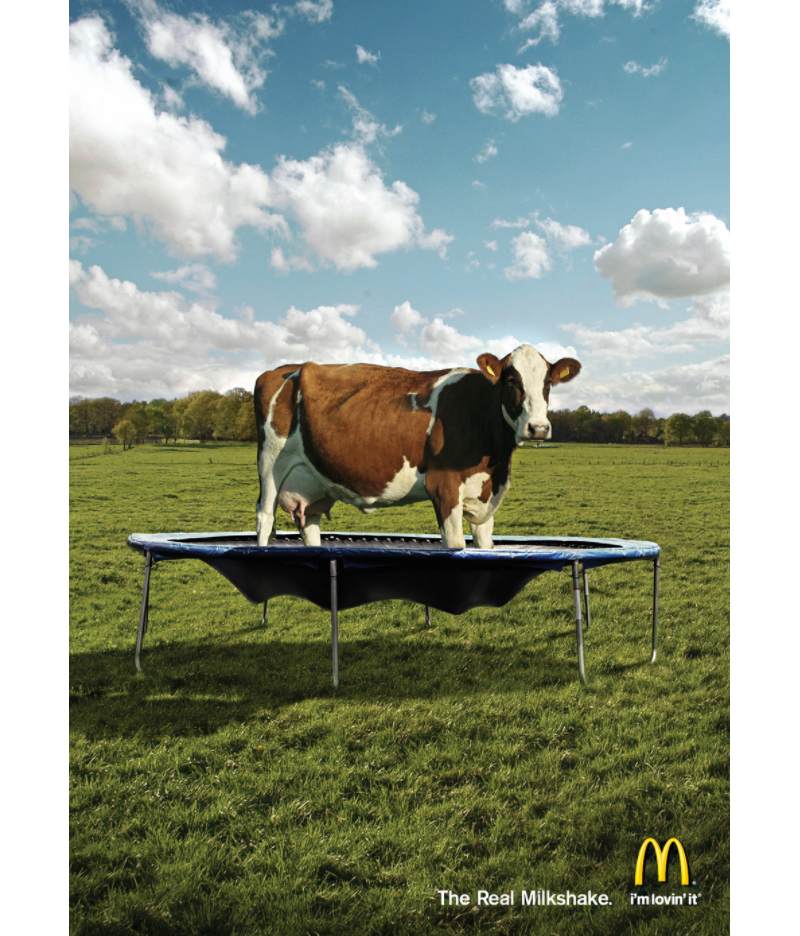
This McDonald’s ad had me laughing for a while, all because of the ad copy and imagery. It works because you have a cow on the trampoline, and it will “shake,” then when milked, it will become a “milkshake.” It’s a great approach to promote a product while making people laugh.
4. Ephone900
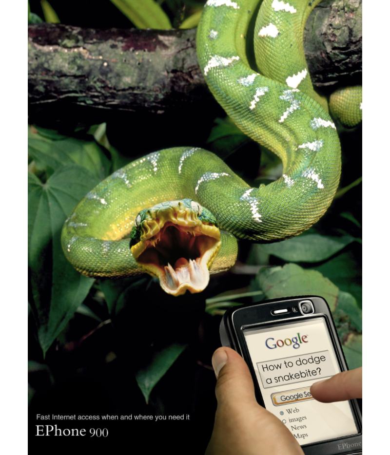
Since our smartphones have become a huge part of our lives, we can’t help but use them in scenarios that may save our lives. Ephone does that in their print ads, which makes it funnier. Plus, as the ad copy reads, it promises fast interest, so at least users can access the internet anywhere, especially in life-saving instances.
5. 3M
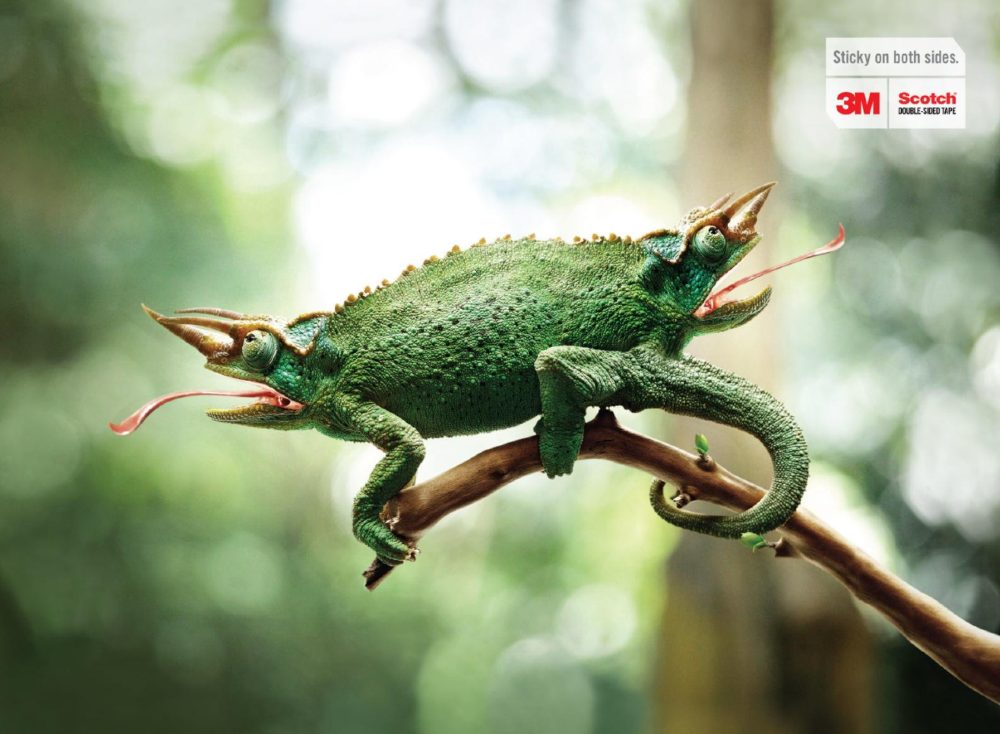
3M demonstrates that you can promote a product without sticking to something familiar. Usually, we would see surfaces or papers getting stuck, but the use of fake reptiles indicates how strong their products are. Even if they might not have used actual reptiles for the image, they stay true to their ad copy, “sticky on both sides.”
6. Amori
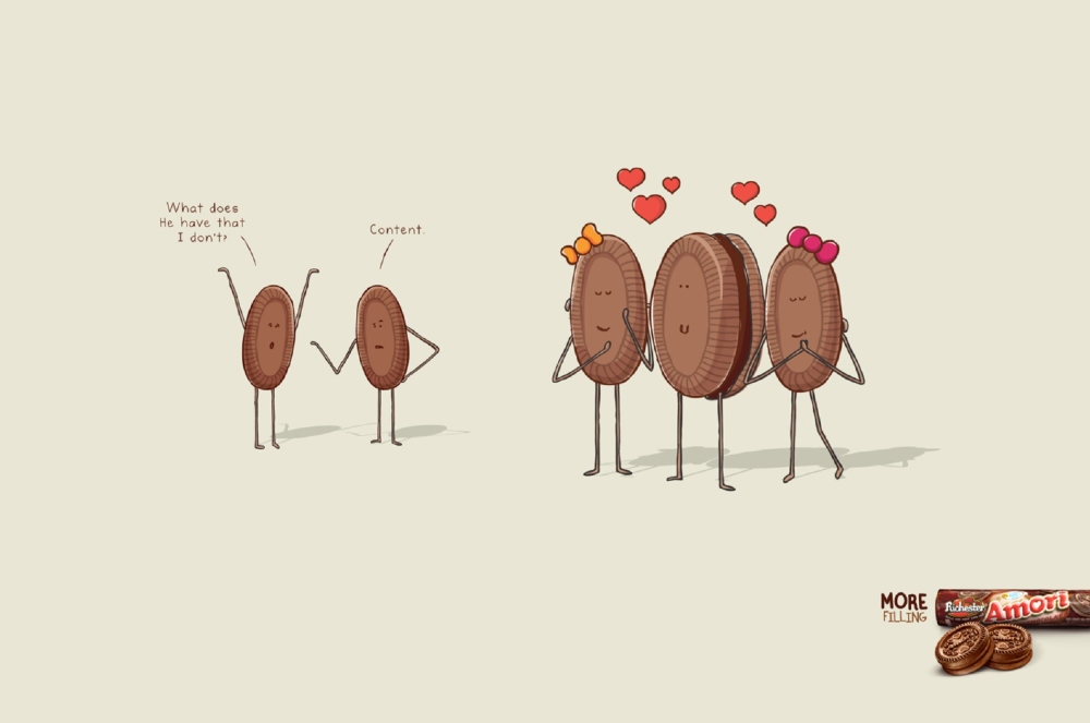
Here’s a print ad that’s a likely subtle dig to Amori’s competitors. It’s a hilarious concept of showing they have more filling. Plus, it’s great they used dialogue as part of the ad copy making it much more interesting and funny.
7. Durex
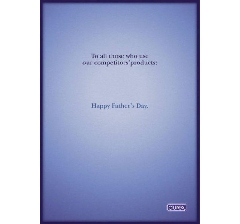
Durex is known to release funny ads here and there, but this ad takes the cake. It’s a cheeky way of telling fathers that they could’ve used Durex if they didn’t want to have kids in the first place. It’s why this ad makes it on our list of funny print ads.
8. Ricola
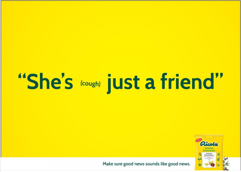
Ricola’s print ad is one of the most iconic funny print ads because it incorporates sound without audio. The addition of the (cough) suggests that the speaker seems unsure. And by eating Ricola, you can clear your throat and deliver news such as that with confidence.
9. Hyundai
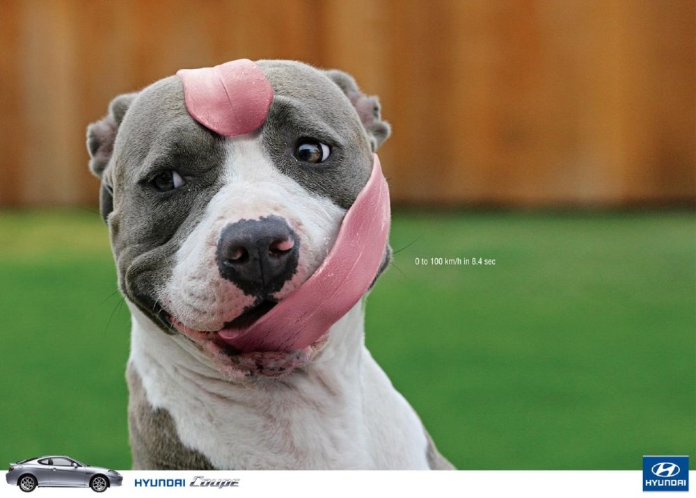
Show speed without having to use a car to do it. That’s what Hyundai did to one of their print ads and ended up having a funny print ad because of it. The ad copy indicates the speed and time, but it’s a clever way of illustrating a unique selling proposition without resorting to typical marketing approaches.
10. Google
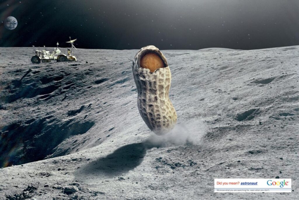
We’ve all made typographical errors as we search something on Google. The search engine corporation effectively used that without offending us. It will make you chuckle and realize that we can rely on Google, even if we make typographical errors sometimes.
11. Knacki
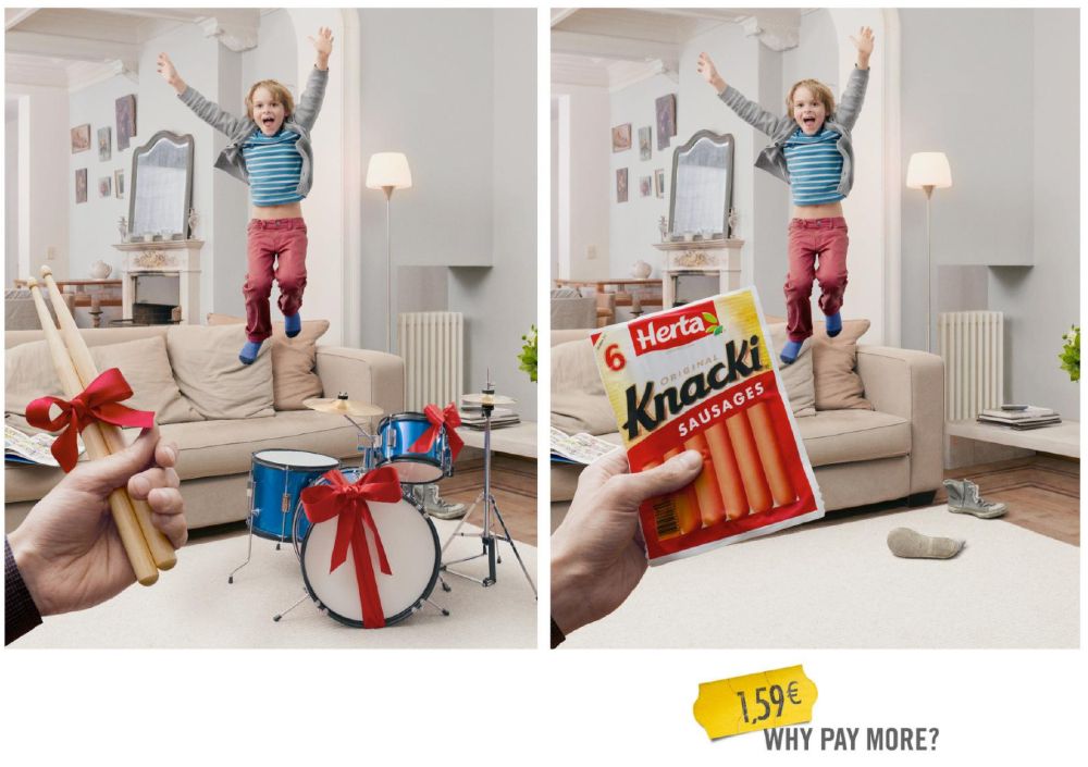
Here’s an example of a print ad that knows its audience. Parents know that kids want toys or gifts that would blow a hole in their budget. Knacki used this to give parents an alternative without making their children feel dismayed.
12. Scotchgard
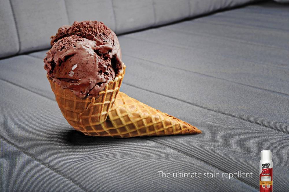
If 3M showed that using animals would make the product effective, Scotchgard takes a much simpler approach that can still entertain viewers. As the ad copy reads, it demonstrates that it’s guaranteed you won’t have to worry about cleaning too much by using their product. It’s a clever idea to show that the product works.
13. Dumb Ways to Die
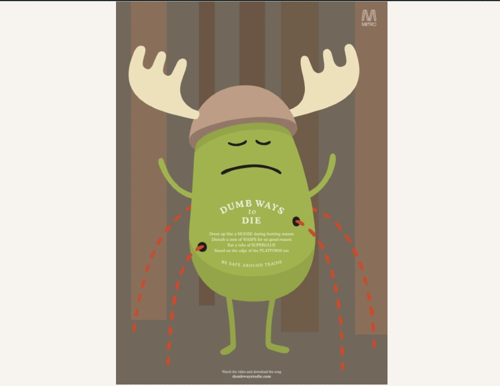
Image Credits: Dumb Ways to Die Wiki
Dumb Ways to Die is a mobile game aimed to make people more careful and safe, especially near trains. Their ad copy uses lyrics of their “Dumb Ways to Die” song to remind players in what ways you can die. This may lean towards dark humor, but they made it funny without being too morbid.
14. Ikea
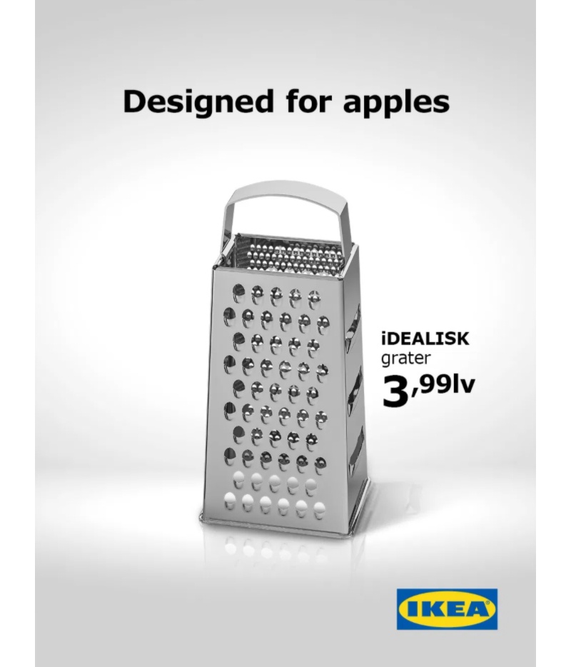
Most brands would make fun of or one-up their competitors. On the other hand, Ikea decided not to follow that for one of their print ads and take a dig at Apple’s Mac Pro. Since many noted that it looked like a cheese grater, Ikea produced an ad campaign to promote a cheese grater. Coincidentally, the grater’s name starts with an I, and it uses similar naming conventions like Apple, making it funnier.
15. Stockholms Hundforum
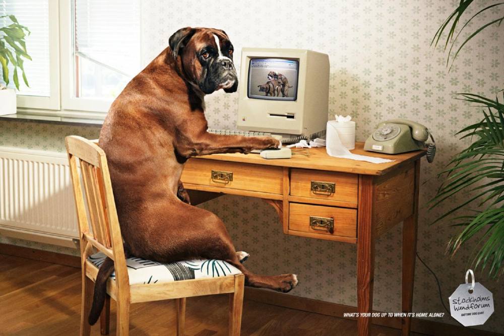
We’ve all wondered what our furry friends do whenever we leave home, and it’s a brilliant way of imagining what they may do. Even with its NSFW nature, you can’t help but laugh at the execution of the overall ad. That’s why it makes it on our list of funny print ads.
16. Expedia
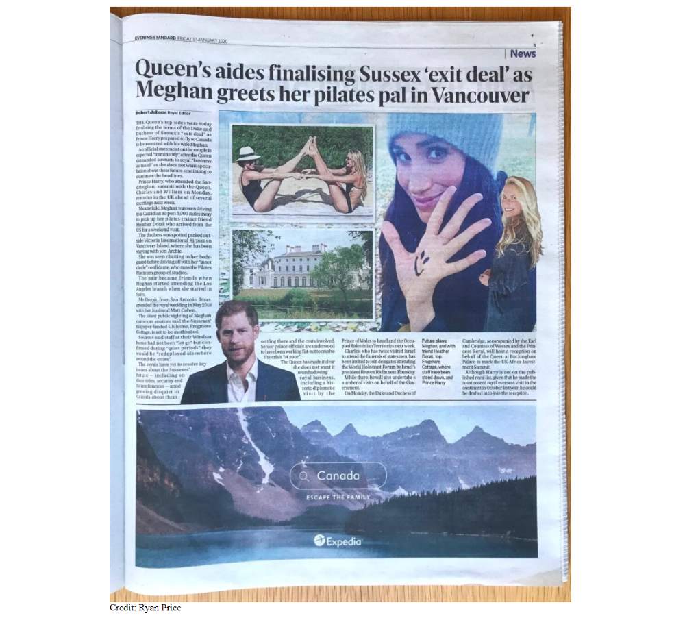
Image credit: AdAge
Brands that capitalize on events may have a hit or miss moment. In this case from Expedia, it even went viral. The ad copy, “Escape the Family,” with Canada written on a search bar, references Meghan and Harry’s exit from the royal family. It’s a funny approach to staying relevant and possibly driving more traffic to Expedia’s site.
17. The Atelier
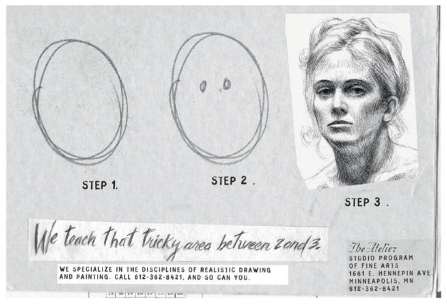
The Atelier print ad is effective at making you laugh and would possibly make you take action. They indicate they know how to accomplish the drawing process, and the reader would too, so long as they call. It’s an example to consider if you want people to do something after reading the ad.
18. Calgary Zoo
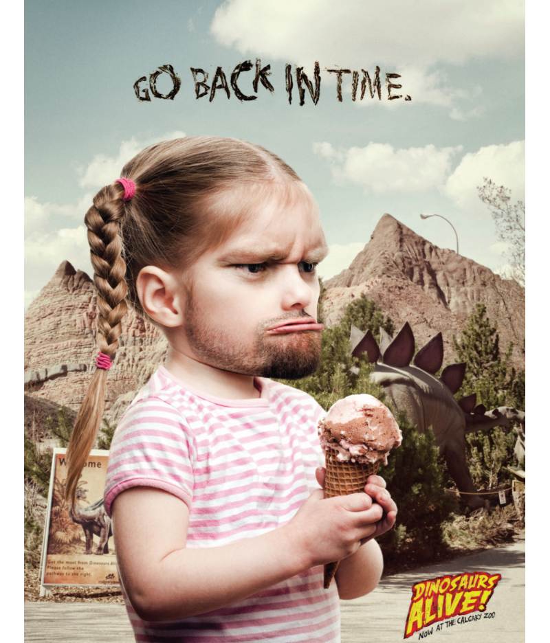
Upon seeing this ad, it made me laugh hard because it looks crazy. But you realize what the copy says, “Go Back in Time,” which makes it even more funny. Calgary Zoo wanted to promote their Dinosaurs Alive attraction, and you may feel like a neanderthal when you see those dinosaurs again.
19. Jeep
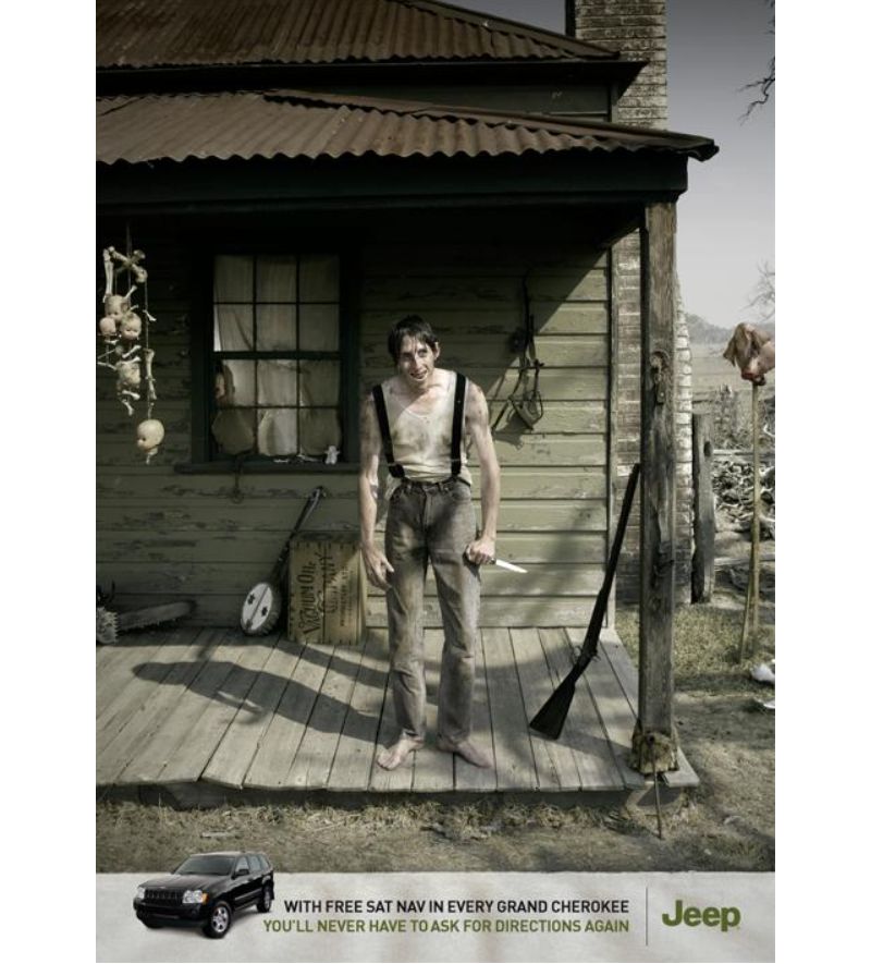
Here’s another print ad with dark humor but still presents one of your product’s main features. Since cars would usually emphasize their speed or safety, this one by Jeep shows you can show a feature without sounding too sales-y. They want to ensure that their customer can avoid trouble and their car can save their life.
20. Juicy Fruit
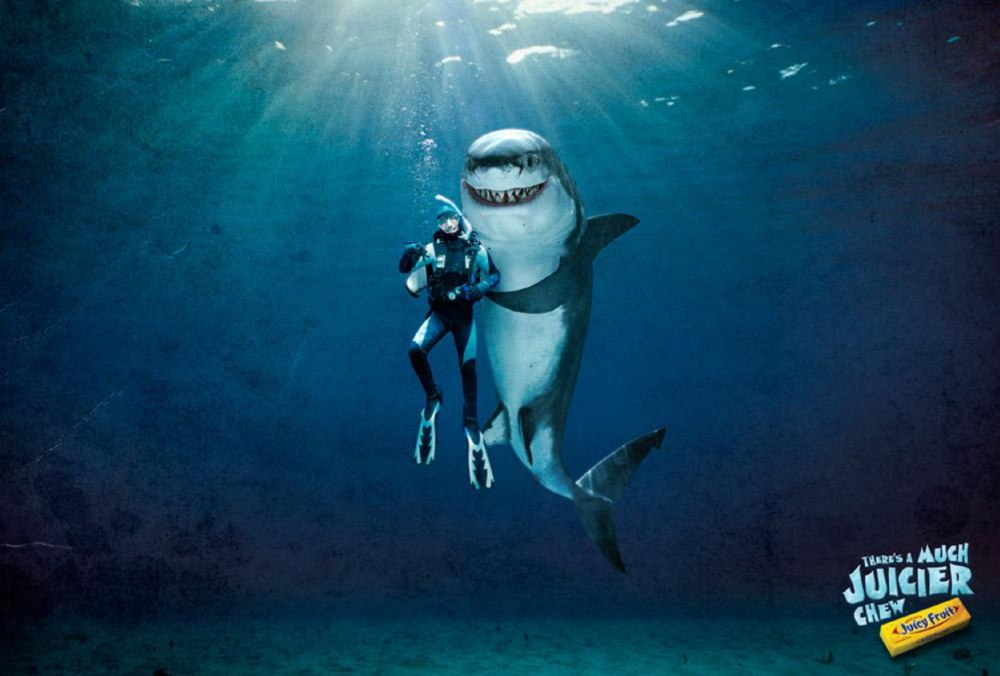
Brands aren’t afraid to go out there, and Juicy Fruit’s one of them. This makes our list of funny print ads because while sharks would settle to eat fish, the human would be the much juicier (and possibly more satisfying) chew. It appears that Juicy Fruit wants to set itself up as the leading gum brand among its competitors, despite the imagery.
21. Renault
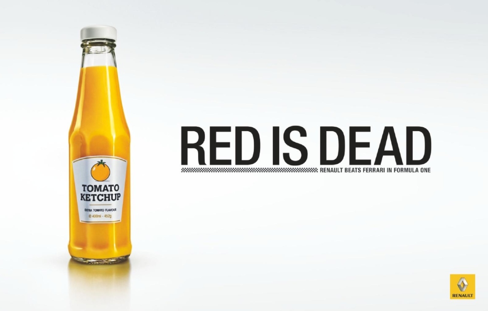
According to Ads of the World, Renault won the Formula One Constructors World Championship again in 2011. And since Renault’s brand color is yellow, they changed the typical red things like ketchup to show Renault will have the spotlight for once. As for the ad copy, it’s hilariously straightforward and clear.
22. Pedigree
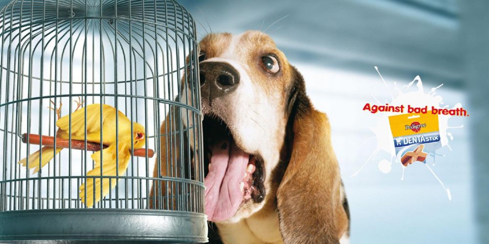
Dog owners may relate to this ad and would get a kick out of it. While we don’t know what happened to the bird, this ad helps activate our sense of smell, and Pedigree made it work. It could persuade dog owners to buy their product to prevent a similar scenario from happening.
23. Lego
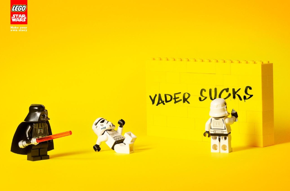
Here’s another ad that uses another Star Wars reference. Lego is great at allowing our imagination to run, and in this ad, the copy reads, “Make your own story.” True enough, the ad did make a story that didn’t appear at all in the movie. It’s one of the funny print ads that made me laugh out loud.
24. Ovaltine
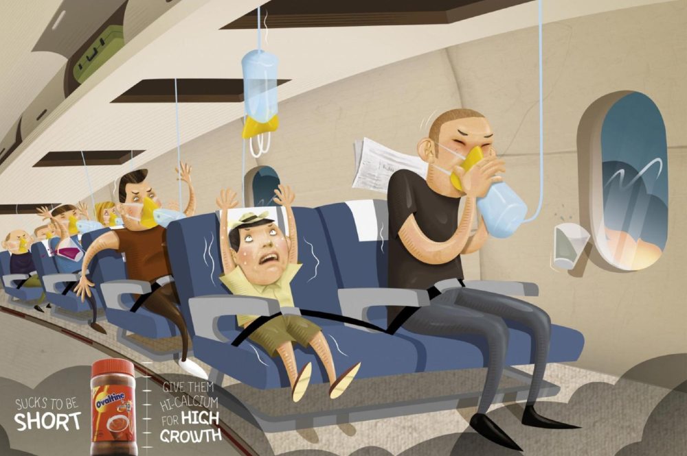
Small people can relate to this print ad, and they may get offended or find it funny. Ovaltine took the opportunity to promote the product, which could help a person grow. It’s also targeted to parents, so their kids can grow and reach whatever they could, without needing assistance from taller people.
Plus, I would agree with Ovaltine’s ad copy; it sucks to be short.
25. Bonds
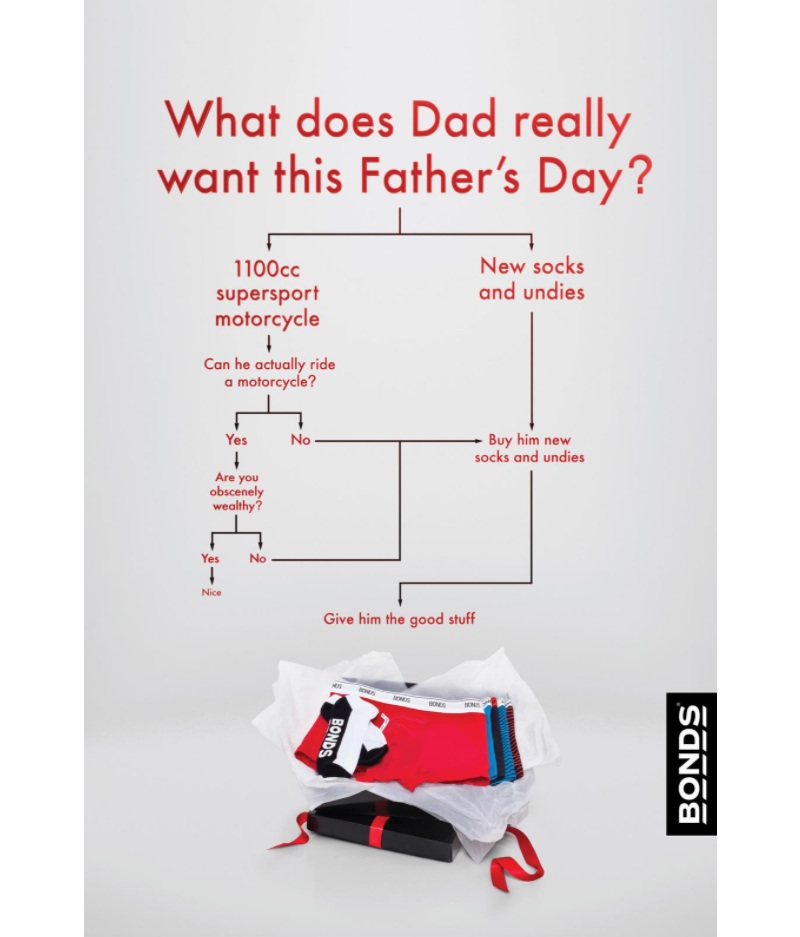
This Bonds ad is unique because it uses a decision-making flowchart, and you won’t see it anywhere else. It’s one of the most funny print ads because of the two choices presented. Unless you’re “obscenely wealthy,” you’ll most likely end up buying a new pair of socks for your dad.
26. National Geographic
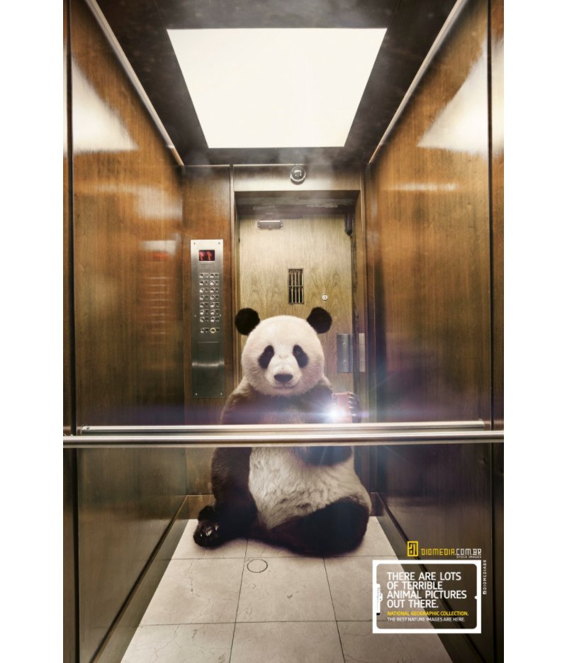
National Geographic (Nat Geo) is known to be serious, particularly relating to the environment and wildlife. But Nat Geo didn’t hold back when they observed that terrible photos exist out in the wild. In turn, they had animals take selfies, which is hilarious.
27. L’Échange
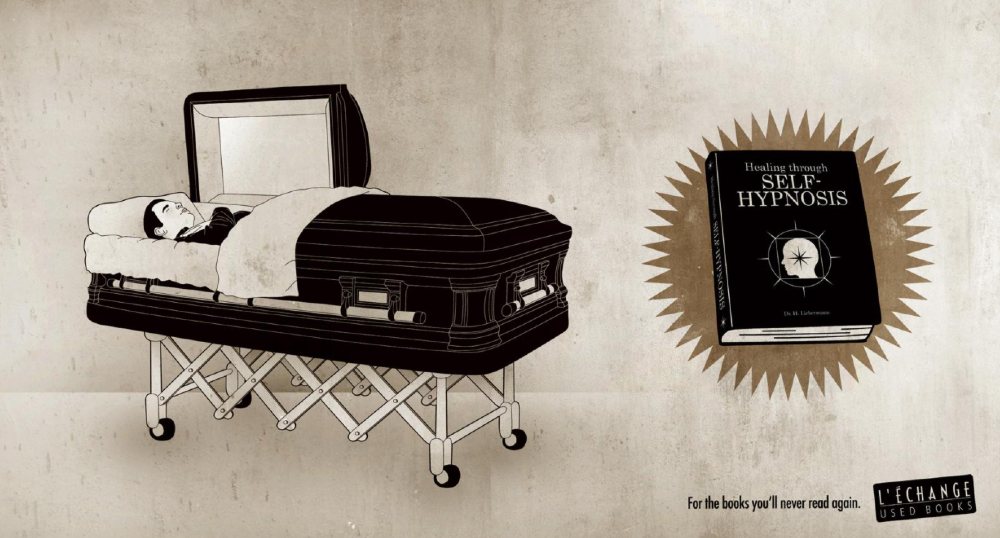
You will see a lot of dark humor in print ads, and this one by L’Échange will have you chuckling and shaking your head. The ad goes two ways. The first is that the deceased may no longer read the book, making sense with the ad copy. The second is that maybe they read the book and hypnotized themselves to healing for good. Either way, it’s a grim take and a clever way to promote their business.
28. Ephydrol
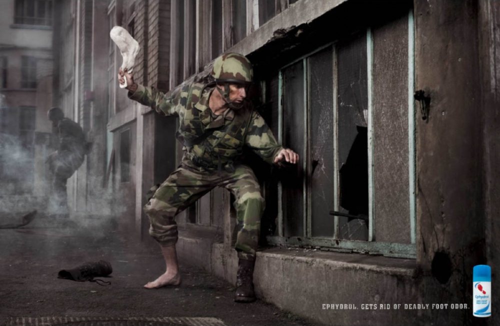
Image credit: We Love Ad
Make ads more interesting by using other senses. This ad activates your sense of smell. It helps you imagine a bad foot smell and take pity on the one getting hit by the sock. And if the soldier uses Ephydrol, as indicated by the ad copy, he no longer needs to throw or use his smelly sock to attack an enemy.
29. Listermint

Here’s another bad breath ad, but instead of using a dog, it’s aimed at humans this time. The ad copy reads, “bad breath affects those closest to you.” The imagery makes the ad hilarious, but it’s unfortunate for the patient who needs immediate assistance.
30. Mountain Riders
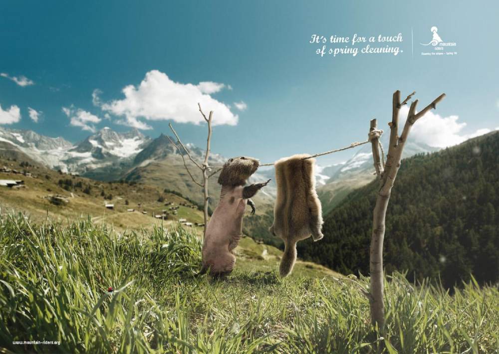
The Mountain Riders are a non-profit organization dedicated to educating people about ecology and responsible tourism. Their print ad is hilarious, thanks to its imagery. The ad copy shows that the animal would suit up once again for the spring and do their part to clean their environment.


